
Wipeout!!! - 3 Fictional Companies Project
In early 2019, I decided to start a new project to practice my design skills. The challenge I gave my self was to create three fictional companies, complete with a Motto, a Logo, and an Icon.
After setting the rules, I started exploring ideas for what these three companies would focus on. What would they sell? What items would capture a customer's attention?


I decided that these three companies should focus on apparel and accessories. I made this decision due to the large amounts of companies advertising their apparel and accessory goods on social media platforms like Facebook, and Instagram.
I had just completed my work on the first fictional company, now it's time to tackle the second one.
Here some examples of the apparel and accessory designs I created for the three companies.
I got a lot of ideas from having watched the X-Games as a child and as an adult.
Rough waves
As explained in the first fictional company, Zenith, I am a huge fan of the X-Games. Since childhood, I did my best to watch it every summer. One Sport however that I found baffling to see that it had little coverage at the X-Games was surfing. I always found surfing to be amazing and mesmerizing. I wanted to surf through a wave tube, like in those famous surfing videos and pictures.
With that in mind, I wanted to create an Extreme Sports company that would also include surfing apparel and accessories.
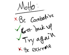

First thing's first, I need a motto to help me craft an identity for this fictional company. Something that has to do with surfing and extreme sports. If you've ever watched any extreme sports event, including surfing, you'll notice that many of these athletes usually fall, and or get hurt. Sometimes pretty badly. After rewatching some old footage, I started scribbling some ideas down. I landed on the idea of "Getting back up and trying again". I know, it seems a little cliche, but it sure helped me find a good footing.
Next was choosing a name. The name should bring the idea of wanting to get back up after failing and trying again. Wanting to show the wave, or that ramp, who's boss. I explored some words that would perhaps give off that sort of feeling. In the end, WIPEOUT!!! won out. I liked the idea of using three exclamation points to give it sort of an extreme edge. You might've wiped out! but you're not completely out yet!

The next thing to do is coming up with a symbol that would match the name of the company. With a name like Wipeout!!!, the first thing that came to mind was a crashing wave. After sketching a few waves, I tried creating a falling surfer, and as much as I liked it, I felt it wouldn't work well. I went back to the crashing wave idea but decided to make it a little more abstract. In the end, I feel I came up with a very nice symbol that I can see many surfers, and skaters slapping not their boards, to tattooing on their arm.
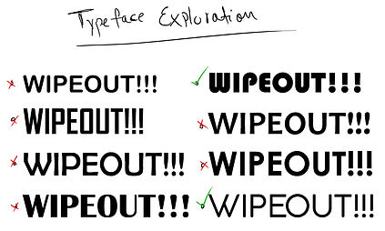
Almost done, now I need to find the right typeface. Time to explore. I usually like to scroll through typefaces on photoshop, and selecting any that I find interesting. I then put them all against each other and try to decide which ones best match the feeling I looking for. I ended on a typeface with a groovy 60's feel, that I think would match the abstract wave symbol well.
Made it back to shore

Here is the final product. I added an effect to the text and superimposed it over the symbol which I enclosed in a circle to help make it feel nice a neat.
The Wipepout!!! logo is complete. Now it's time to make a variety of apparel and accessories. Below are some of the best shirts, boards, and other accessories that I designed using the Wipepout!!! Brand.


